I was contacted by Heidi of Earth Love 10 to create a logo for her upstart project.

The concept is about encouraging everyday people to help “clean up” the earth any time they are out for a walk on a trail, a path, around their block. With the help of a washable reusable bag, you can collect trash that might otherwise harm the environment or wildlife and make sure it is properly recycled or disposed of.
Heidi had done a sample sketch of the basic idea she had for a logo design, and included some notes on colors or other things I might consider including in the design.
And then I was off and running on seeing what I could come up with.
I began by placing her simple sketch into the background in Adobe Illustrator and playing around with ideas for how to show “earth” without being a literal globe with continents.
The Earth is 3/4 Water
I can recall the statistic you are taught in school of how the earth is 3/4 water and 1/4 land. So I went with that when dividing up a circle into these three parts. I like to think of the dark blue as the ocean, the light blue as a lake/river/stream and the green as land.
With Heidi’s notes about including trees or stars I kept thinking about having a tree coming up out of the earth as shown.
Meanwhile I also started playing around with more circles and leaf shapes in the earth itself to add more color and interest. Later on you will see I used these shapes even more and I like to think of the circles as bubbles or shrubs and the leaf shapes as splashs and waves or vegetation based on the colors they are in.
I should mention that the max number of colors that I could include here is 7 (based on the print company who will be producing products for Earth Love 10).
I played around with these shapes and that tree some more. But in doing so I knew that I really needed to get the Earth Love 10 name figured out so I could place it inside the earth area – and not have the design details behind it detract from it too much.
No suitable fonts a round.
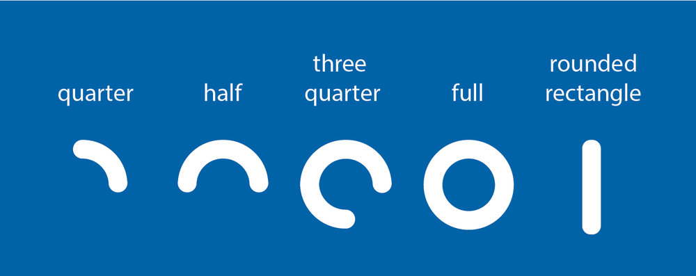
I kept thinking about the round earth and went looking for round fonts but did not see anything quite like what I had in mind. I am a total novice when it comes to making my own text from scratch, but given I wanted everything to feel round and circular I made up the following shapes to build the letters out of. This kept it simple (in my mind at least).
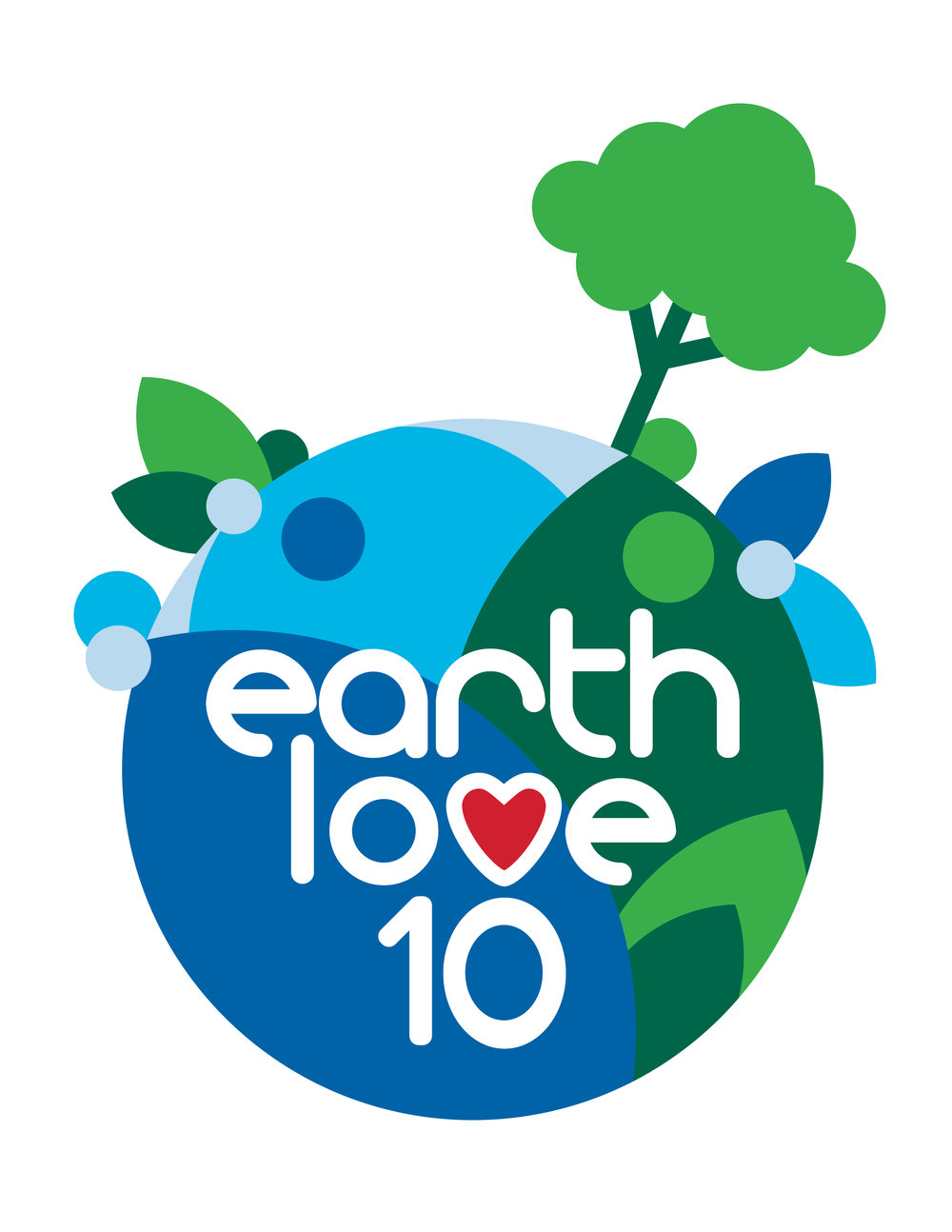
It took a bit of playing around but I finally got a letter set I liked using these shapes. In Heidi’s sketch she had one of the letters in Love replaced with a heart so I took advantage of that and worked it in here as well.
Then i started moving a few things around. Most notably the tree. It just did not feel right coming straight up out of the top of the earth. So I angled it and moved it over some.
That left me with a nice opening to add more story to the design. At first I was thinking about someone walking or even riding a bike. I tried making a simple bike but it was too busy looking. And then I went back to the purpose of this entire project – to clean up the earth – and I knew exactly what I needed.
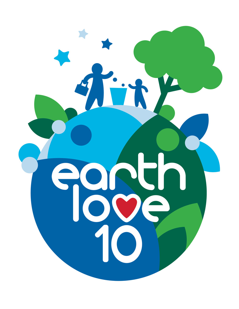
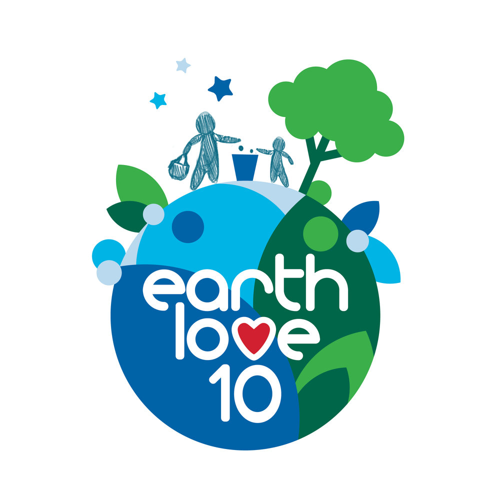
I brought the design over to Photoshop so I could sketch someone throwing out some trash they picked up. And to balance that figure out, I added in a second smaller figure. I like to think of the adult passing down this good habit to the next generation. At the same time I added in some stars to help balance the height of the tree (and also because they were also a wishlist item of Heidi’s.
Then it was back to over to Illustrator to finalize the sketched figures into the logo design. And I was really liking how this whole thing had come together.
Lots of options!
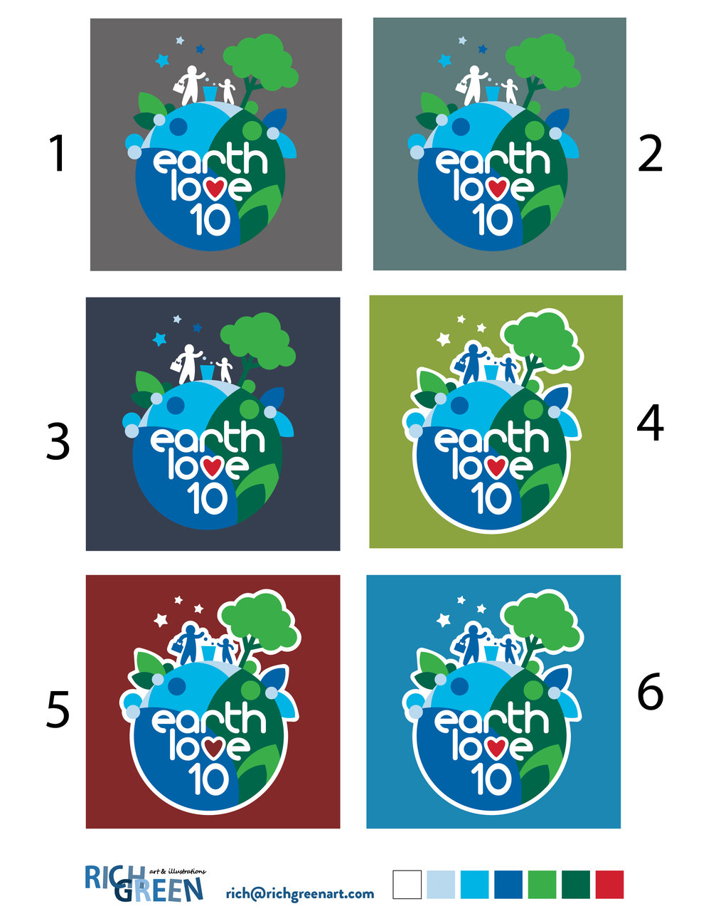
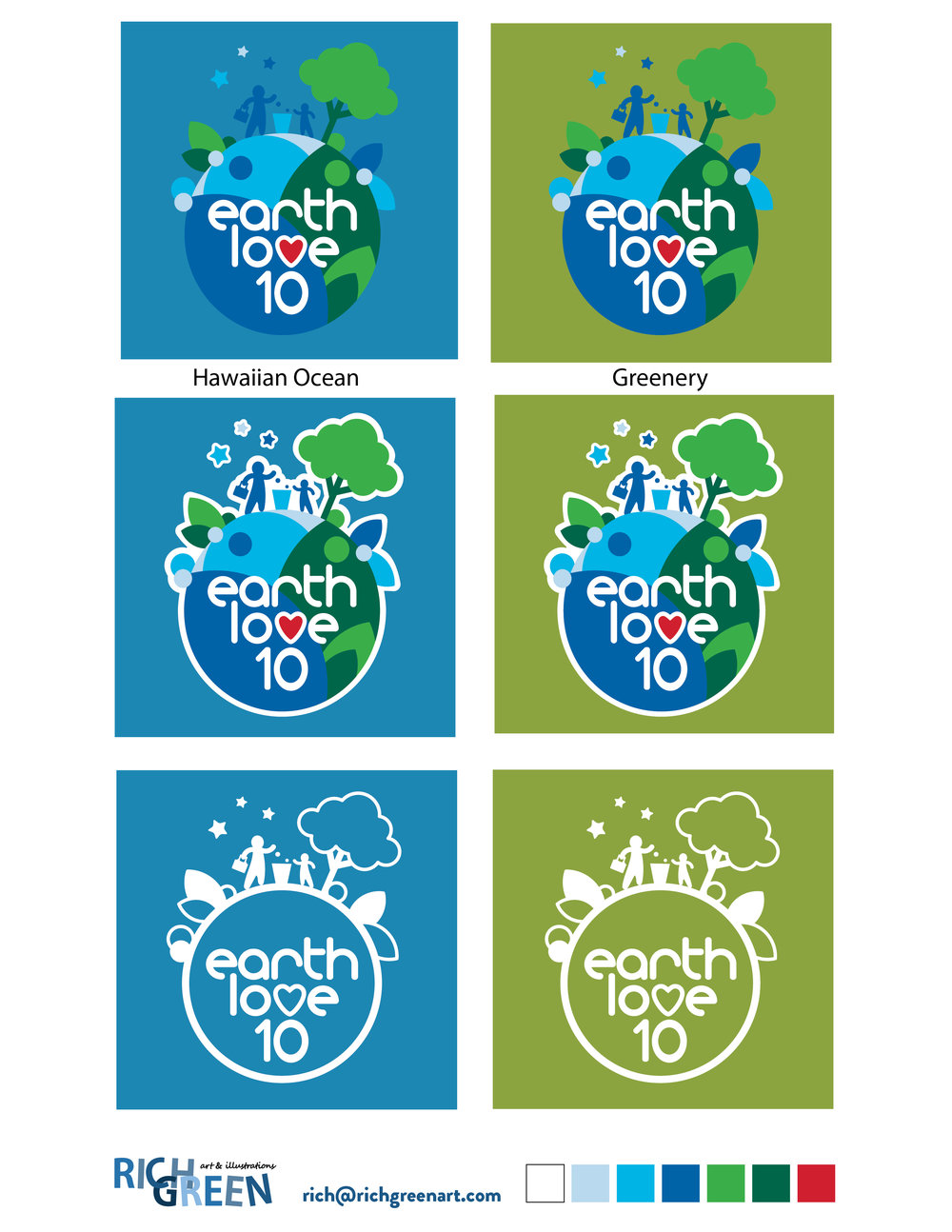
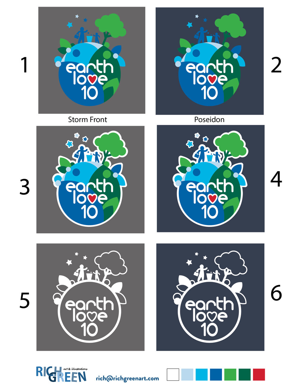
With the full color logo ready. I started to mock it up over potential product colors the logo will be placed onto.
And I also played around with adding a white border on some colors to help the logo “pop” more against the background”.
It is so interesting to see how the design reacts when placed over the different potential fabric colors.
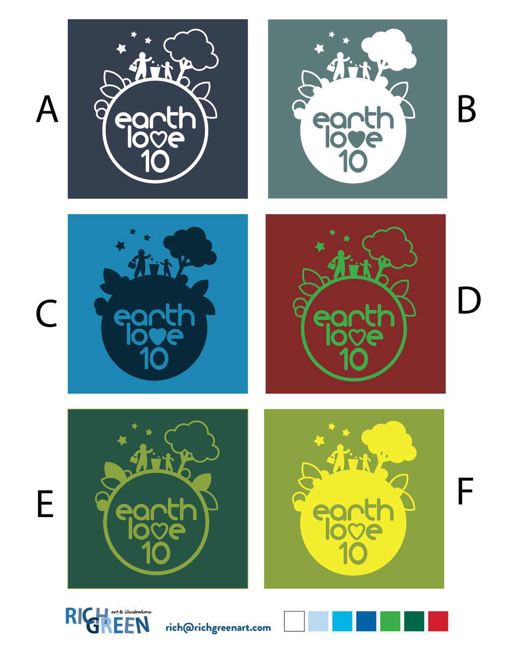
Along with a full color version of the logo a single color version will also be needed. So then it was time to start thinking about how to simplify the design down into a single color approach.
I provided a handful of variations, playing with outlines, solid silhouettes and a mixture of the two. And I also displayed them in various colors just for inspiration in product design going forward.
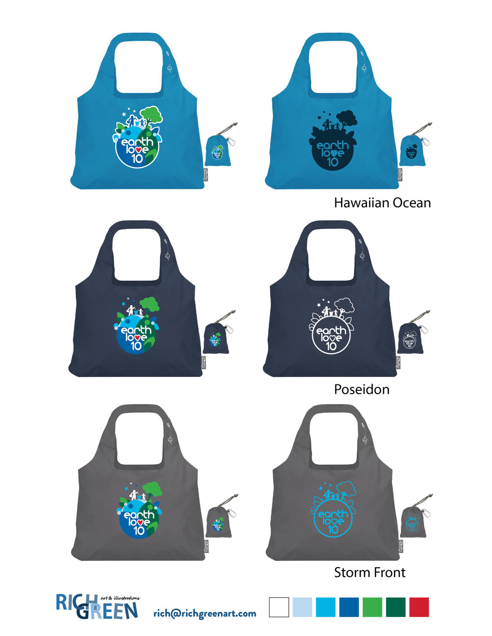
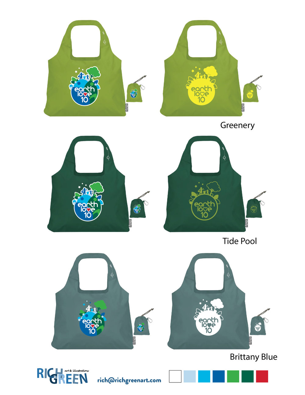
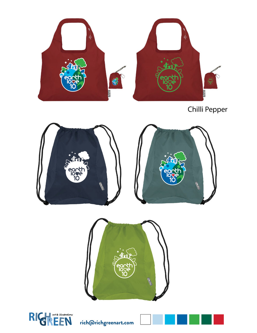
The first product the design will be used on is the bag to collect the trash along the way. So I also mocked up the logo designs onto product samples to show how any/all of the variations might look to help Heidi in her decision process.
After having a chance to review all of the options Heidi made her selections and we came up with a full color logo, a full color logo with white border and a single color logo design she can use going forward. I placed them over her favorite product fabric colors so that she has a real clear understanding of how they might look before she places her order and production begins.
Support Earth Love 10’s Kickstarter Campaign!
I am looking forward to seeing how the first batch of bags turns out! But in order for that to happen Heidi and Earth Love 10 need your help over on Kickstarter!
Do something good for yourself and the earth, pledge your support today: https://www.kickstarter.com/projects/earthlove10/cleanup-our-earth

