Imagine what it would be like to walk into a commercial art studio in Detroit in 1981 without any formal training as an illustrator and ask for a job.
You now have a pretty good idea of how Garth Glazier’s career as a professional illustrator began.
As a graduate with a BFA from a small liberal arts college he knew that he had to find a way to make a living by drawing. Getting a job in a studio gave him a chance to learn from some of the best talent in the country.
28 years later, he is still in “the business” and still creating some really high quality artwork, like a fantastic new set of concept posters for the ever popular cult classic, Star Trek.
The posters are a continuing series and Garth took a completely graphic approach using only flat color, creating the artwork in Adobe Illustrator.
Check out two of the posters below, as well as a study sketch. At the bottom, you’ll find closer detailed captures of the individual characters.
Enjoy!
Garth Glazier is represented by American Artists.
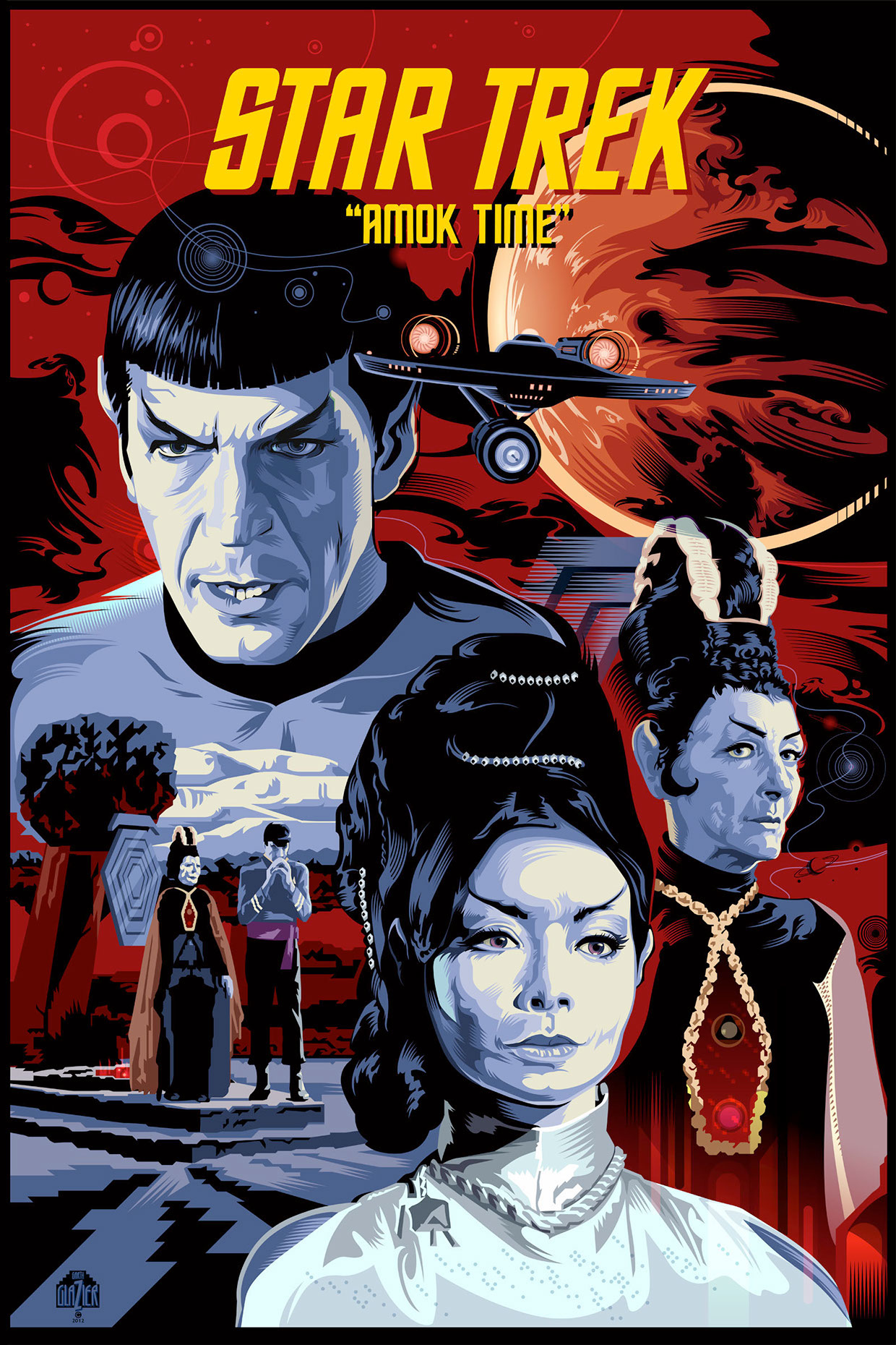
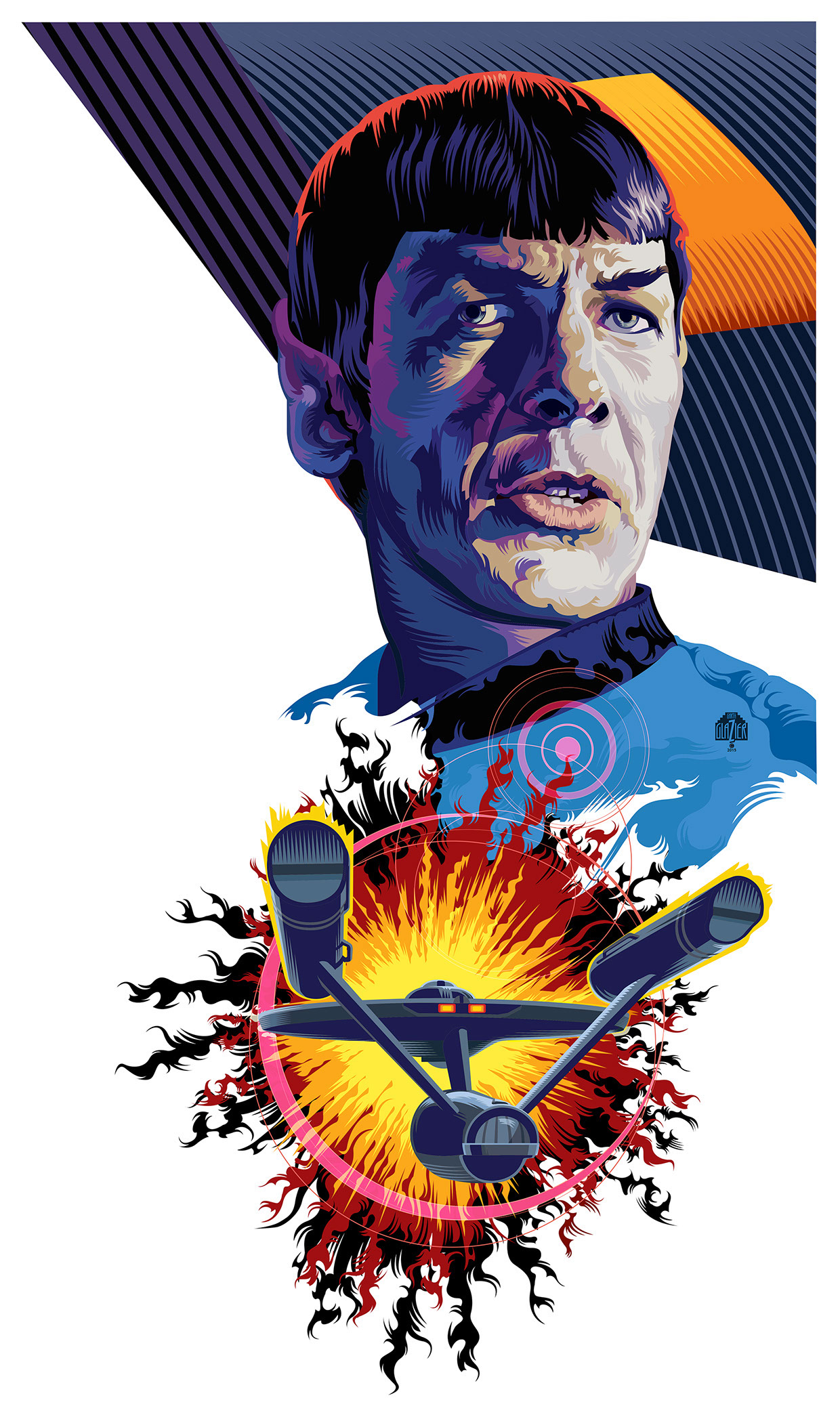
“AMOK TIME”
The completed poster with dynamic design limited to red, blue, and black.
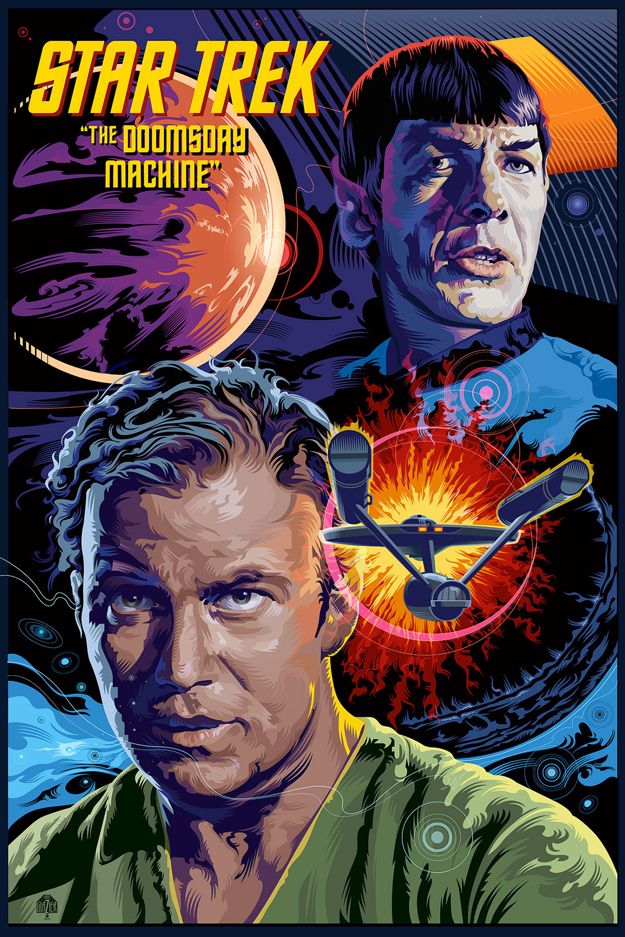
“THE DOOMSDAY MACHINE”
This is version one of this design. Garth wanted to repeat the circular shape of the doomsday machine in the planetary bodies. He chose magenta and aqua as dominant colors for this second illustration.
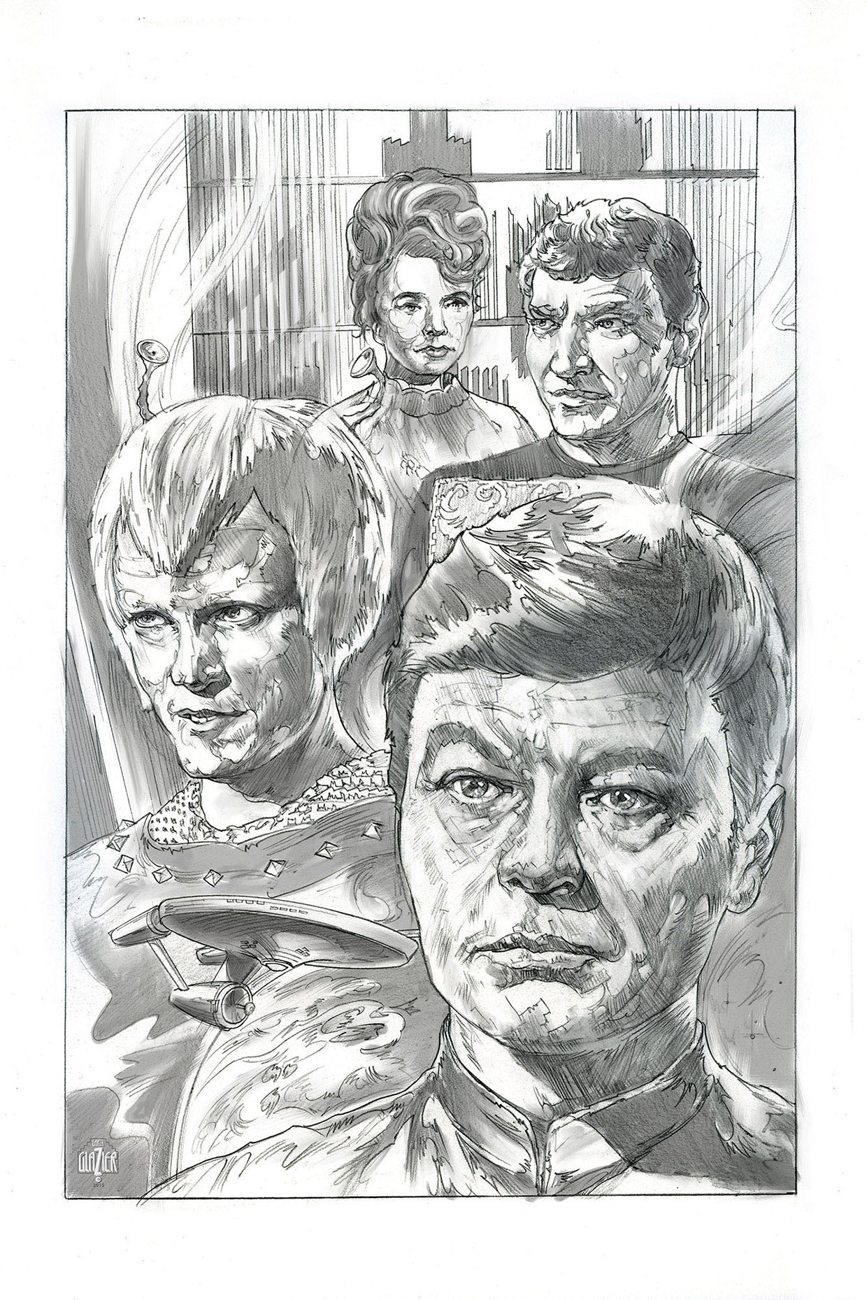
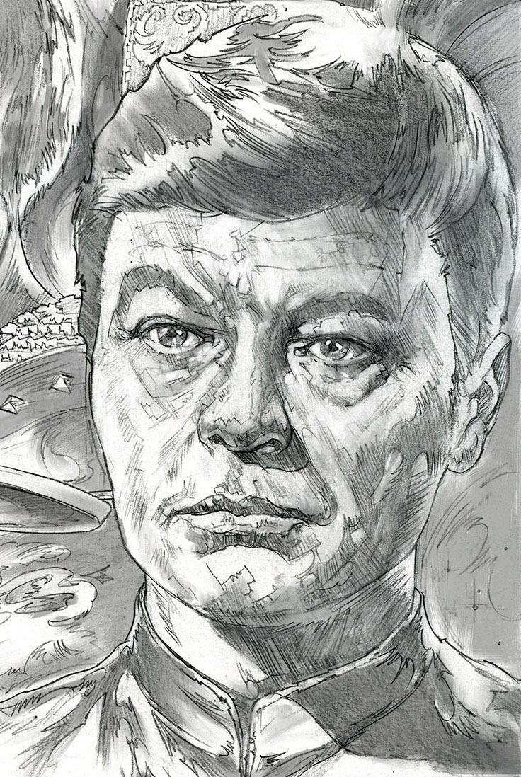
“JOURNEY TO BABEL” This is a complete pencil study for the next poster. Garth used Photoshop to add gray-scale tones. The effect is rather elegant and gives him a chance to visualize the placement of dark and light tones for the final render.
-

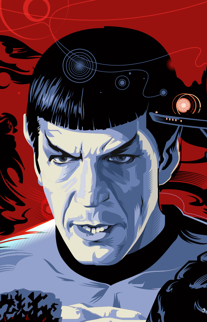
- Detail of Spock for Amock Time
-

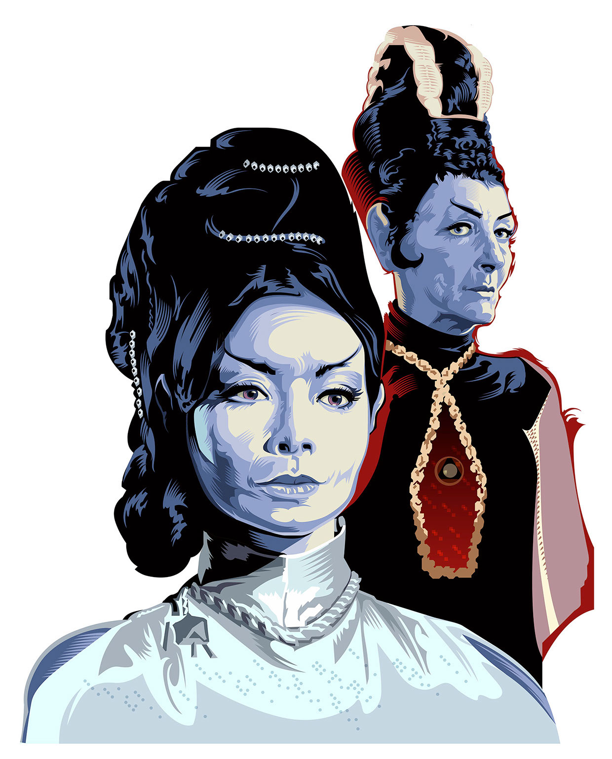
- Portrait of T’pring and T’Pau for Amok Time
-

- Portrait of Captain Kirk for “The Doomsday Machine.”

-
- Portrait of Spock for “The Doomsday Machine.”
-

- William Shatner from Star Trek The Motion Picture

-

- Detail of “Bones”