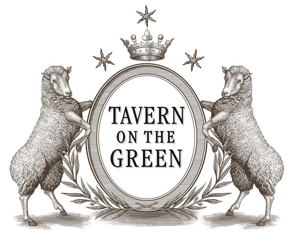
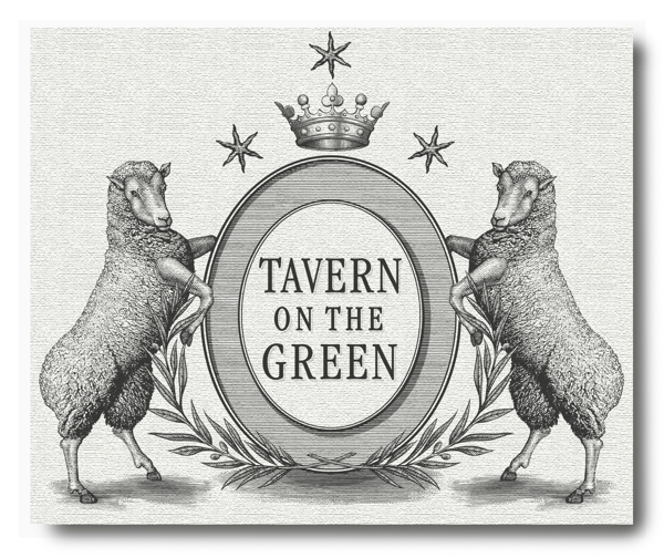
For their reboot of Tavern on the Green, owners Jim Caiola and David Salama wanted Steven Noble to create a logo that felt contemporary while still referencing the restaurant’s storied past. The logo will be used throughout the restaurant on menus and business cards, as well as on the restaurant’s famous red awnings through how they tweaked each iteration of the logo — beginning with the first prelimnary draft — before landing on this final look.
Tavern on the Green was originally built as a sheepfold in current day Central Park . The sheep were actually held there at night and let out on Sheep Meadow during the day to graze and mow the lawn. Since we were going for this farm to table concept, the sheep really were a good vision for that sort of food.
The idea was to contemporize the Tavern on the Green brand. But they always knew they were ode-ing to the sheep. There was a history they were trying to acknowledge with the crest and the animals. When you see this, you think of a family’s history or a place’s history, so they liked this idea.
The final design feels timeless, but also contemporary. It feels fun, but not too self-conscious. It’s beautiful and modern and clean.

