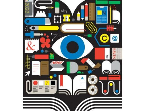
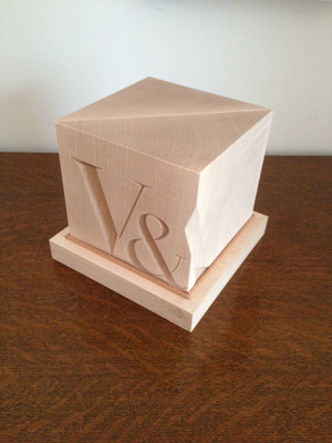
 I won the V&A prize on 16 May- scooping the best Editorial category and the overall winner- the Moira Gemmill Award for Illustrator of the Year 2017. The trophy- bookends inscribed with the museum's logo are carved into a wooden cube. The V&A (Victoria & Albert) is- according to its website- 'the world’s leading museum of art and design' and its annual illustration prize is 'UK's most prestigious annual illustration competition'. My thanks to all involved- particularly the judges, trustees and the staff of the V&A and all at the Telegraph. Here's a little more information about the process behind the artwork…
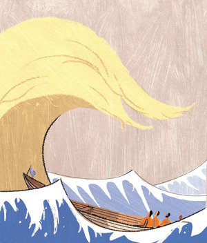
I have worked on the Sunday Telegraph’s weekly Money section cover for a number of years, originally being commissioned by the Telegraph’s Head of Design Jon Hill, whom I had worked with on a number of magazine re-designs early in my freelance career. Typically I will receive a precis of the headline article on Thursday evening from the section editors, Richard Dyson and Richard Evans. Both are usually busy putting the finishing touches to the Saturday paper edition at this time. I usually submit a number of roughs and, once approval is given, work up the chosen illustration for delivery by email in digital form within the space of a few hours. Sometimes I work things up before getting a green light- testament to how much I still enjoy the assignments and how much confidence I have that the editors trust my instincts. The absolute deadline for the artwork to be ‘off stone’- with the printers- is Friday afternoon although it’s rare for the assignment to spill over into Friday. I have an excellent working relationship with Richards Dyson and Evans and they tend to have faith in my ability to provide reasonably original visual metaphors for topical financial issues. The problem-solving aspect of editorial illustration, providing apt solutions to sometimes unpromising subjects is something that I still enjoy. Having been briefed over the telephone about the subject for this assignment on Thursday 10 November- in this instance the potentially dramatic ramifications of Trump’s election victory the previous day on financial markets- I set about producing a number of roughs on the concept of markets bracing themselves for impact. My two roughs explored the theme of shockwaves, employing an oblique likeness of Donald Trump. The roughs- heavily pixellated scans of back-of-an-envelope scribbles- were sent by email at around 5.30 with the annotations ‘1: Trump’s hair as Hokusai’s wave looming over a small boat, 2: shock waves radiating across the Atlantic, eastern seaboard of the US resembles Trump’s profile’. The reply from Richard Dyson at 6pm indicated that they liked both. He went on to say that it was hard to envisage exactly the tone / appropriateness of the first, although it was the one that he I preferred, signing off with the caveat that they didn’t want the illustration to be too lighthearted or trivialising. I began working up both of the pictures in parallel in Photoshop to see which I preferred. Inevitably the Hokusai pastiche won out: the frozen moment of anticipation built in to its instantly recognisable composition with the wry reference to Donald Trump’s equally recognisable hairstyle providing a visual solution that was sophisticated, not too obvious, and, despite the wave metaphor, avoided partisan editorialising. I built the image in Photoshop from my original sketch, resizing the scamp to the print proportions (169mm x 199mm- figures that are etched on my brain). I draw using a Wacom graphics tablet and apply colour in layers digitally, selectively employing line work to anchor certain pictorial elements without allowing the image to become dominated by the line and become too cartoonish. Texture comes from scanned, acrylic-painted sheets that I piece together within the Photoshop file. The final image was sent digitally at around 8.30pm. I was told that the image had been well received at the paper and, whilst I intend all the images I produce to be conceptually astute and aesthetically appealing, I knew that this was a rather special set of circumstances and that the illustration worked particularly well.
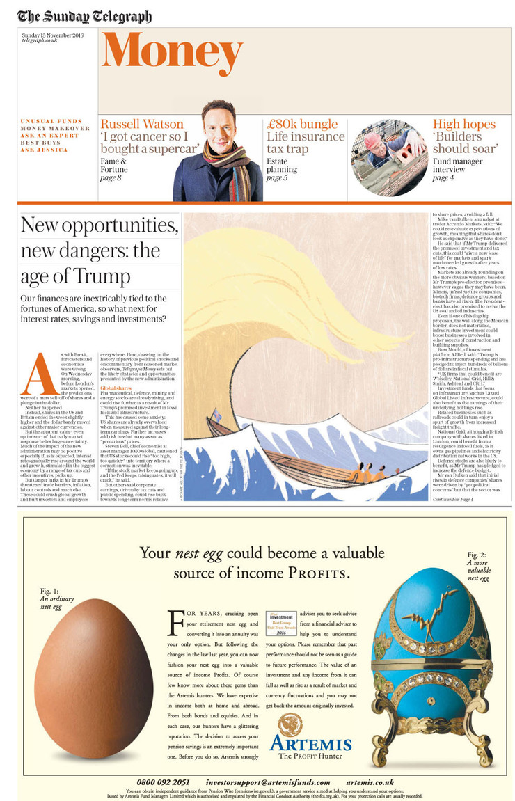
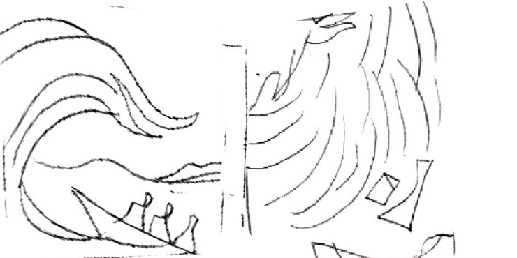
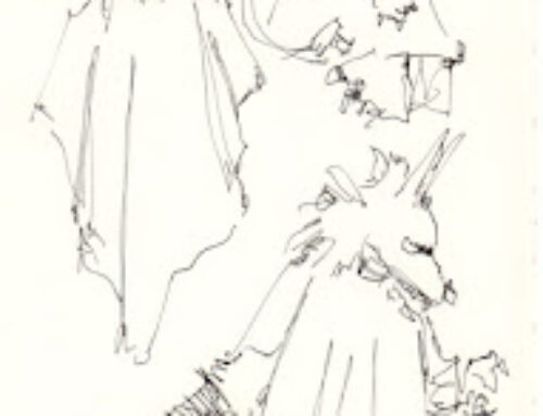
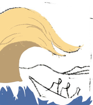
 Having plumped for the wave I began working over the low res rough in Photoshop
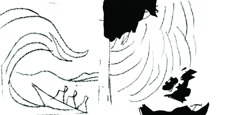
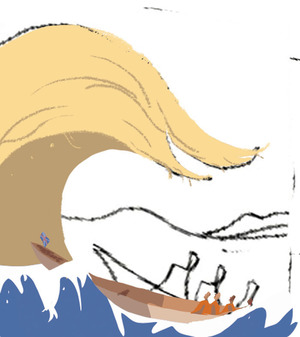
 …further blocking in colour…
 Refining detail
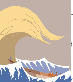 …sky…
…sky…
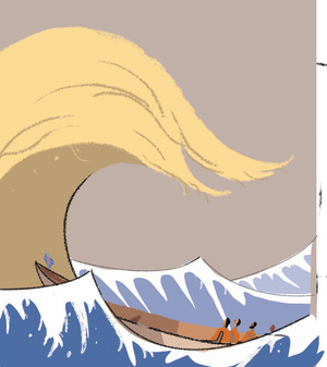 …applying (and selectively removing) the linework
 More detail
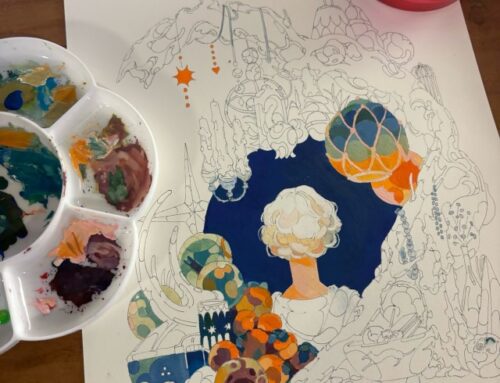
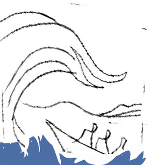
 Applied texture.