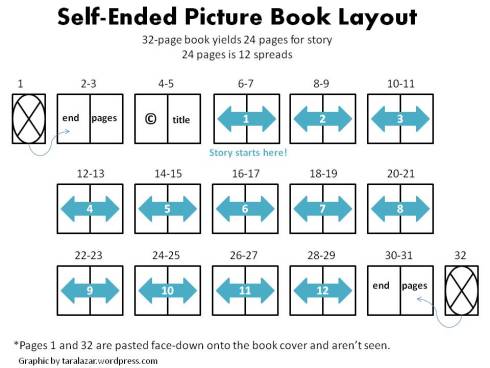
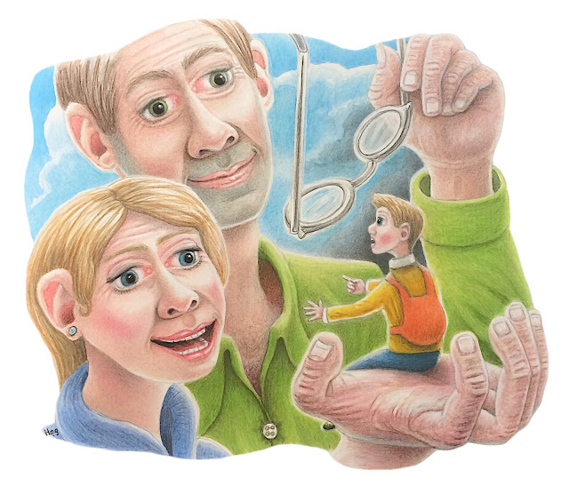
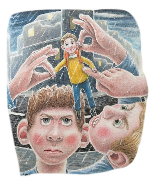
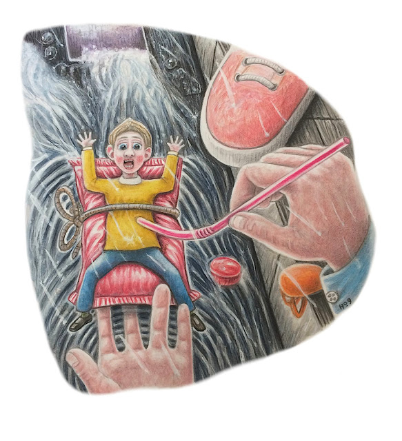
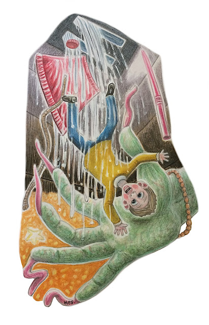
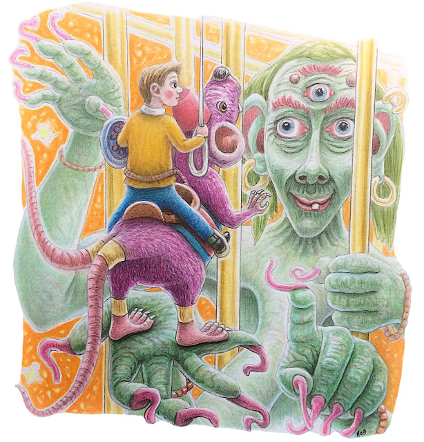
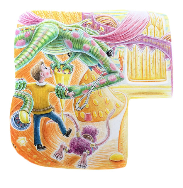
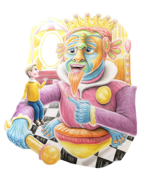
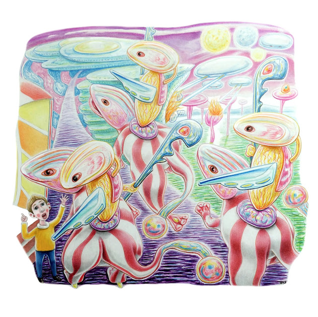
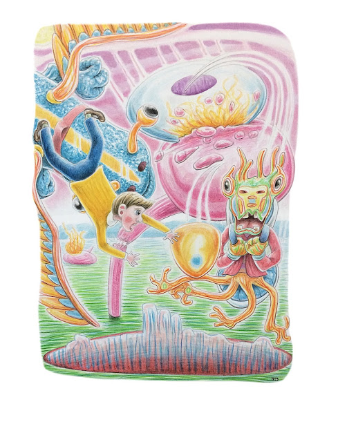
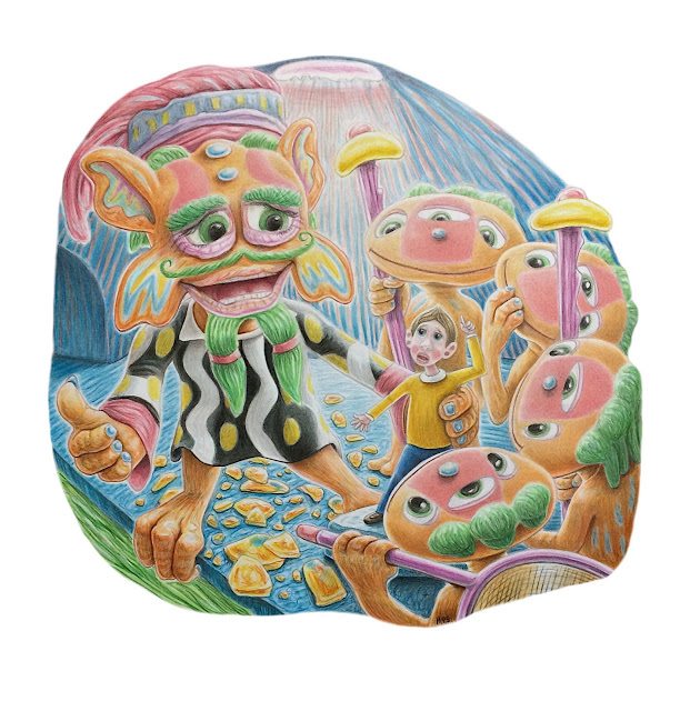
Little Jack’s big Adventure is a children’s book I have been working on sporadically for around 8 months. There have been big gaps in its production due to moving home, and building a portfolio amongst other life occurrences. I dislike the fact that it has taken until now to get it to the tenth image stage. If it was a commissioned project then it would of certainly taken 1-4 months to complete. I am writing the book myself along with the graphic design. I am also producing the cover illustration, and so there is more time yet to be taken up with these processes. In all I have two further interior illustrations to complete and one book cover illustration. Below is a graphic of the book layout:
As you can see there is room for twelve interior illustrations ( and a few smaller vignettes if required intermingled with the text) If we presume there will be an illustration and a page of text on alternative pages . For this book I have produced all the illustrations in a vignette format ( floating images with a white surround.) each illustration will fit right up to the near limits of each page. I have considered full bleed images, as a majority of children’s books tend to contain full bleed images. However I decided against this as a preference. In the future I will consider using alternative formats for my illustrations in subsequent books I have planned. The size of the finished book will be 10″x 8″. Which is standard for children’s publications. I had the main idea for the book many months ago, the general premise is of a little boy who tries to be big and the subsequent adventure he has in obtaining a larger size. The story is marked by a number of ‘life lessons’ that will become apparent as the story comes to its conclusion. I am writing the story as I go, I have had the basic bones of the story laying around in sketch books for a long time, and as I have developed the images to feature at varying points in the story, I have also developed the writing further. I am confident in writing a story and have done so before as a young boy, and later throughout my time in education. I do enjoy the creative writing process. It is fortunate that I am able to illustrate the story as well. The images themselves have brought up their own set of problems throughout their creation. Not least, when transferring a traditionally produced artwork into the digital domain. Every Illustrator can account for this. Each image goes through a number of stages, in lighting, tonality and colouration along the way. This can be exasperating to say the least. In my particular case, Each image is firstly rendered with traditional media, all the lighting, tonality and colouration is produced in light which changes constantly. Then when all appears well. it is photographed, which changes the the lighting, tonality and colouration, then when transferred to the computer with its back light and own colouration dynamics, the the lighting, tonality and colouration, changes again!, there is also a final stage when the image is printed, when the lighting, tonality and colouration will change yet again. There are hundreds of, methods that can be employed to change the lighting, tonality and colouration digitally as you go from one stage to another, it is almost possible to get to a very close version of the original work, but it never wholly will. If you could see my original work in reality you would see a very significant difference, the depth of colour for example and the finite tonality variations are far too complex for technology to replicate fully as is, maybe as technology advances further it will manage to replicate realty in the future. The whole process is extremely finite, complex, and troublesome. And so as an artist you are forced to reimagine the whole image again, and again and again, which is extremely exasperating. Sure digital methods can expound upon various aspects, however, I am a purist at heart, I chose traditional methods to produce my work for fundamental aesthetic and emotional reasons, and the fact that it has to become digital is a bitter pill to swallow. No doubt I will be tweaking each image further as new problems arise and preferences change, however, the images below represent the finalised versions, for now at least. I have made a conscious decision to change the general colouration and tonality of each piece and stage in the story, for the reason of visual dynamics and interest making, but also to lead the viewer into different environments, this difference in colour and tonality, will also be utilised as a graphic device to aid the story, as you will see in the final publication. Below are the first 10 illustrations:
Finally, I would like to say a bit about subject matter. Recently on social media someone stated that some of my images where too graphic for a children’s story in that the subjects were too sad or negative. However, The whole purpose of the story is to guide, enthuse and educate children. The book has a age demographic of 6-12+ There are numerous very successful books from the past, and in current circulation that also offer an honest, graphic and negative view of the world. Red riding hood and the big bad wolf, for example, and some of Shaun Tans work is really quite dark, but is very popular amongst children and adults alike. The images alone are not enough to give a representation of the whole story, It may appear that parts are negative, but all will become apparent when the writing shows the way. The conclusion to the story is a positive one, indeed the negativity within the story exemplifies the final positive outcome for Jack.

