INTERVIEW: FATINHA RAMOS, COVER NO. 38 ARTIST
“I am a storyteller. I illuminate things that I believe in and that I find important to communicate to the rest of the world.”
~ Fatinha Ramos
The Directory of Illustration is the world’s leading illustration resource. Each year, we distribute our printed Directory free of charge to thousands of art buyers who regularly hire freelance artists and animators.
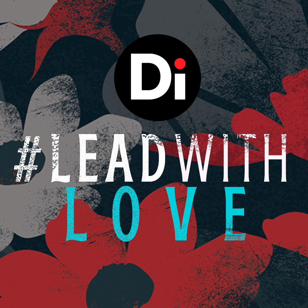
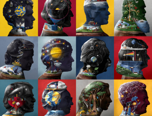
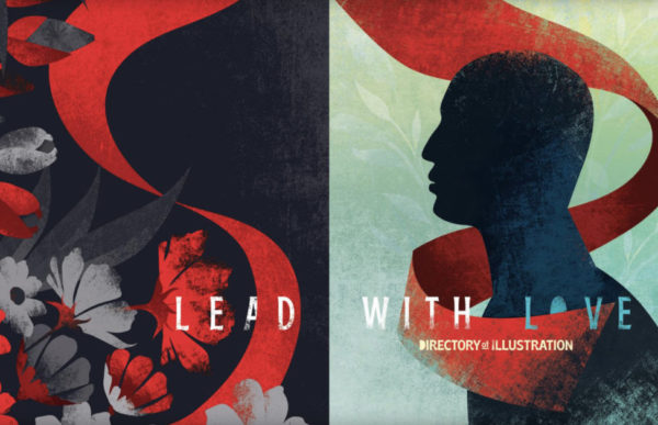
To celebrate DI38’s outstanding cover, we sat down with Fatinha Ramos to learn more about her creative process behind this year’s beautiful design. The theme for DI38 is “Lead With Love,” in celebration of inclusivity, diversity and embracing a better and brighter future. Fatinha brought this theme to life with her use of rich color, light and dark contrasts, bold shapes and her dynamic compositions.
MEET FATINHA
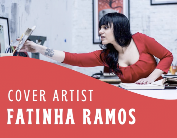
It’s with great pleasure that we introduce our amazing cover artist, Fatinha Ramos! Fatinha is an award-winning illustrator and visual artist based in Antwerp and originally from Portugal. After working in art direction and design for twelve years, she took a giant leap and followed her dream, working full-time as an illustrator. Her work has appeared all over the world and she has received numerous awards, including the Society of Illustrators NY, 3×3 Magazine, Communication Arts, Global Illustration Award, White Ravens and she was the overall winner of the World Illustration Awards 2021. Fatinha is represented by Rapp Art.
How did you become an illustrator?
Fatinha: First of all, I would like to thank the Directory of Illustration for this amazing invitation. I feel so honored to be a part of this amazing collection of covers. It’s not only [about] my cover – I think the whole story of the Directory of Illustration is amazing, it’s such high quality and I really feel honored to be part of it. Thank you to Tamra Dempsey (President & Creative Director) and Lisa Wiant (Designer) for the wonderful teamwork.
How did I became an illustrator? I think it was from the moment I was born. I think I’ve always been [an illustrator]. I am a storyteller and I translate stories through images. I illuminate stories. I illuminate things that I believe in, and that I find important to communicate to the rest of the world. As a child, I always drew, but all children draw so it’s not when you begin to draw, it’s actually if you stop drawing – that’s the big problem. I actually never stopped drawing and I kept on working a lot. I have a very, very peculiar story. I was in the hospital a lot growing up and I drew a lot from my bed. My first exhibition was when I was eight, in the hospital itself! I’ve always told stories through my drawings and that’s where my soul and my purpose lie.
Can you elaborate on how you developed your skill, your technique and what feeds your creativity?
Fatinha: Yes. It’s a work in progress. I think for all artists, it’s not about arriving somewhere. It’s actually about just loving the process and trying to enjoy it as much as possible. That’s so important. Developing my technique was actually trial and error. I failed so many times – I can’t even remember how many times, but because of those failures, I got to where I am right now.
It’s about the ability to go against the fear that we all have, especially for creative people, of failing. [I developed my skill] through experimenting and always trying to do my best and being competitive with myself and not with other people.
How did you arrive at your final sketch for the cover?
Fatinha: First of all, I immediately said, “yes,” [to the invitation to do the cover] but by then, I was fully booked. It was very exciting to try to look for a time to work on something that I really believed in – I really believe in diversity and the theme that I was briefed, “Lead with Love,” is something I really stand for. So for me, my “yes” was not just because it was for the Directory of Illustration, but because of the theme. It was so close to my heart.
At the time when I made some initial drawings, I also got my first or second COVID shot and I got very sick. I’m not sure, but I think maybe it was because of that shot and my time in the hospital that I was able to come up with some new ideas. I was happy with what I did, but I thought, “No, this deserves even better. Fatinha, come on, just go further…”

…Sometimes you just have to go that extra mile to make something even greater than what you already have made. That’s the big secret, and sometimes some people don’t want to do it…but just do it, just go the extra mile. I was so excited with this project. I did so many sketches because the ideas just kept coming. My hands could hardly follow my brain and keep up!
Sometimes when you stop focusing so much on something and you let it go, better ideas can come in. I was forcing it a little because I wanted it to be really amazing. The first sketches were great, but then when I let them go and I was in another situation… suddenly, boom! I got it. I thought, “I have to …” I had my sketch stuff with me and I just had to start sketching!
I thought, “I have to send this right now because I do believe it’s going to be even better. They’re going to like it more.” I gave myself extra work but I totally take the responsibility for it and I think it was really worth it.
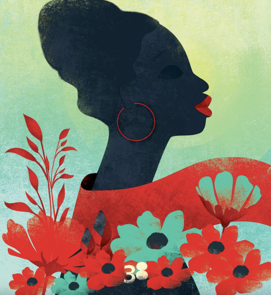
Can you tell us about the woman on the front cover?
Fatinha: The woman on the front cover represents all women and all different kinds of women, diversity, and minorities. [The woman] is looking straight ahead, happy, enjoying herself and like a flower coming out, [she’s] looking to the light. She stands strong like a hero. She’s inviting the reader to open the book and to follow her scarf through the book. She’s a symbol of strength [and] of resilience, especially after these last two years that we’ve all been through.
She’s a symbol of all the fights that we have been through, throughout history with racism. She’s the symbol of victory and she’s the symbol of speaking to the rights of people. She represents everybody. To me, it was important for it to be a woman. There are some men inside [the book], so no worries, there’s balance… I’m a feminist and feminism means men and women, same rights, same level. Not more, not less, the same. We are different but we can have the same…
To me, it was important for her to be a woman because we are so powerful and we’ve been through so much throughout history. For me, it’s a kind of celebration, of coming out of the darkness and going into the light.

“For me, it’s a kind of celebration, of coming out of the darkness and going into the light.”
Can you elaborate on the diversity represented within the pages?
Fatinha: Yes. It’s very difficult when you’re working visually on diversity to not fall into clichés. I tried to make my characters diverse, but they also represent the whole – everybody. To me, it was also very important to [include] a person with a disability because people with disabilities are the biggest minority in the world, and there’s still so much work to do for them.
To me, it was important that the woman in the wheelchair has a strong position. She’s the one who is linking everybody. She’s the one who’s most visible because one of the problems for people with disabilities is that they feel unseen.
She is on the right page, because we read from left to right, at least in this part of the world, so she’s the one who’s in the lead…and she’s looking to everybody. She’s the one who’s most visible. That was really important to me and for it to be recognizable in all cultures, everywhere.

How was the color palette chosen?
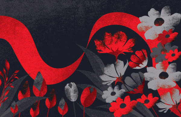
Fatinha: It was actually a little bit based on the end sheets. There were just two colors, so I thought, “Okay. I have to think about a color that would go with the red, but that would also transmit a little bit of contrast because it’s about contrast, it’s about differences brought together.” This is why I came up with the blue and then the yellow for the cover, because I thought it has to be very bright in a way… it was a growing process.

Are you open to sharing your secrets on how you created the cover and what your process was from the initial sketch?
Fatinha: Sure. So I do the sketch. It’s very rough. It’s actually not that beautiful. It’s just black and white, with pencil or with Procreate. With anything I have to draw with, actually. It’s normally very rough because to me the most important part is the concept and wanting to communicate that. I just need to sketch to check how the elements are going to be on the page.
Then I paint with acrylic or with gouache and then I scan it. I work further with Photoshop and then I print it out on normal paper. Then I paint over the paper, sometimes again with acrylic and then I use colored pencils, and then I use sand paper to make the textures.
Then I scan it again. I know, it’s a very weird technique. I always say I am a ‘non-technical’ person, so don’t try this at home because it’s really a lot of work repeating this process as much as possible until the illustration is ready. It’s all layers. That’s the way I work.


What projects are you looking forward to working on?
Fatinha: Well, maybe another cover for the Directory of Illustration! That would be great. But maybe for the hundredth edition…I would probably be 100 years old!
Projects – I’m working on personal projects because I think it’s important as an artist and as an illustrator to also work on personal projects. I’m working on my children’s book, my own story… and I’m painting. Then I have other projects, which I may not talk about yet. I’m sorry. But I’m looking forward to all of it. I’m very excited about it because I’m stepping out of my comfort zone a little bit more and taking more time to experiment and to put myself a mile further and further and further. We’ll see.

You’ve won numerous awards. What are some of the awards you’ve received this past year?

Fatinha: I was the overall winner of the World Illustration Awards 2021. I won the gold award for the illustrations market by the Society of Illustrators, LA. I received the Patrick Nagel Award, which is the biggest award. I also received two Communication Arts excellence prizes as well. Who knows what’s going to happen this year?
Congratulations! They’re all well deserved. You have a very unique ability and talent. Thank you for sharing it with us and creating such a beautiful cover.
Fatinha: Thank you. I feel so humbled with all the beautiful words about my work. I think that’s probably one of the best rewards I can have, is that I can touch the emotional chord in people…that people really feel something about my work. That’s really beautiful. Thank you.
(TURN SOUND ON)
BROWSE THE DIRECTORY OF ILLUSTRATION NO. 38
Cover and End Sheets: Fatinha Ramos, represented by Rapp Art.
Creative Director: Tamra Dempsey
Book Design & Art Direction: Lisa Wiant